
How to Get Your First 100 Website Visitors as an Artist
One of the most discouraging moments for many artists is launching a website and realizing that nobody is visiting it.
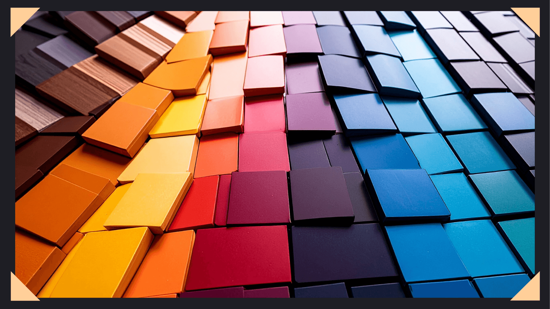
For digital artists, your website is more than just a gallery—it’s the face of your brand, a reflection of your style, and the first impression you make on potential clients or fans. One of the most powerful ways to shape that impression is through your color palette. The right combination of colors doesn’t just look good—it communicates your personality, conveys professionalism, and evokes emotions that connect visitors to your work. Understanding color psychology in art can help you choose colors that speak to your audience before they even see your portfolio.
In this article, we’ll dive into why color palettes are essential for your art website, guide you through selecting the perfect palette, and provide practical tips for integrating it seamlessly into your digital art business.
Color is a powerful form of communication. Psychology studies show that colors evoke emotions and can even influence decision-making. Your website isn’t just a gallery—it’s a marketing tool, a portfolio, and sometimes an online store. The colors you choose can subtly shape how visitors perceive your work.
Color impacts perception:
Rather than relying on a single color, aim to create harmony among a few primary and accent colors that reflect your artistic voice.

Your brand identity is how your audience perceives you. For digital artists, your website is often the first point of contact for clients, galleries, or fans. Here’s how a color palette plays a role:
A consistent, intentional palette reinforces your brand and makes your site memorable.
Selecting a color palette may seem overwhelming, but breaking it into steps simplifies the process:
Examine your art. What colors dominate? Pulling colors directly from your pieces ensures your website feels like an extension of your portfolio.
Ask yourself: How do I want visitors to feel? Your palette should reflect your artistic personality:
Color theory ensures harmony:
Tools like Adobe Color or Canva Color Palette Generator can help you generate palettes based on color theory or directly from your artwork.
Less is more. Aim for 3–5 colors:
Too many colors can overwhelm visitors and dilute your artistic identity.
Once you have a palette, use it strategically:
A strong color palette impacts more than appearance—it affects business outcomes:
For example, bright, saturated palettes attract pop-culture fans or younger audiences, while muted tones appeal to collectors seeking sophistication.
Digital artists have powerful tools to craft harmonious and impactful color palettes. Here are two great options:
Always review your color choices to make sure every visitor can experience your website fully and enjoyably.
For digital artists, a website color palette is a silent salesperson. It communicates your style, evokes emotions, and guides visitors through your portfolio or online store. Choosing the right palette is a strategic decision that impacts your brand, audience perception, and business success.
Analyze your artwork, define your brand personality, and apply color theory thoughtfully. A cohesive, intentional palette ensures your website showcases your work beautifully and leaves a lasting impression.
Remember: your colors tell your story. Make them say exactly what you want your audience to feel.
One of the most discouraging moments for many artists is launching a website and realizing that nobody is visiting it.
Many artists believe they need to constantly create new artwork to make more money. The logic seems reasonable. More artwork
If you’re struggling to get commission inquiries, your artwork may not be the problem. Many artists assume that getting clients