
How to Get Your First 100 Website Visitors as an Artist
One of the most discouraging moments for many artists is launching a website and realizing that nobody is visiting it.
Color can make or break your artwork.
As a digital artist, you can have perfect linework and composition—but if your colors feel off, the entire piece suffers. On the flip side, strong color choices can instantly elevate even simple artwork into something eye-catching and professional.
In this guide, you’ll learn how to use color theory in a way that’s practical, intuitive, and directly applicable to your digital art workflow.
Color theory is the foundation of how colors interact, combine, and influence perception. It helps artists create visually appealing, balanced, and emotionally impactful work.
Instead of randomly choosing colors, color theory allows you to:
If you’ve ever wondered why some art “just works”—color theory is usually the reason.
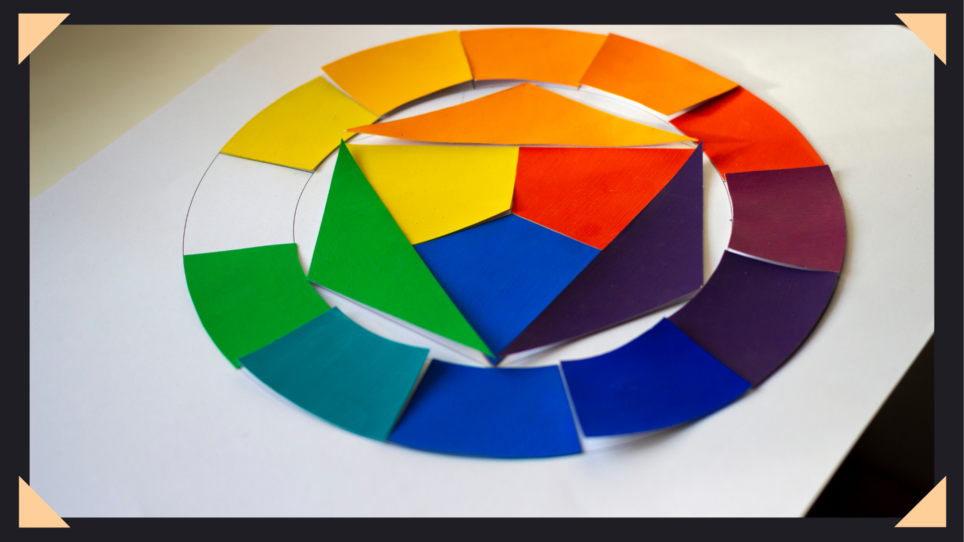
The color wheel organizes colors based on their relationships and is the backbone of all color decisions.
Red, blue, and yellow are the base colors. They cannot be created by mixing others.
These are formed by mixing primary colors:
These are combinations like blue-green or red-orange, adding more variety and nuance.
👉 Digital Tip: Most tools like Photoshop, Procreate, and Clip Studio already use a color wheel—so you’re working within this system by default.
Understanding HSV is critical if you want your colors to look professional.
The actual color (red, blue, green).
The intensity of a color:
How light or dark a color is.
👉 Key Insight:
Value matters more than color.
If your artwork looks good in grayscale, your values are strong—and your colors will naturally work better.
Color harmony is what makes your artwork feel cohesive instead of chaotic.
Opposites on the color wheel (blue & orange, red & green).
Best for:
Colors next to each other (blue, blue-green, green).
Best for:
Three evenly spaced colors (red, yellow, blue).
Best for:
One color with different shades and tones.
Best for:
👉 Pro Tip:
Use the 60-30-10 rule:
This keeps your composition clean and intentional.
Color temperature plays a huge role in mood and depth.
Reds, oranges, yellows
→ Energy, warmth, intensity
Blues, greens, purples
→ Calmness, distance, softness
👉 Example:
A sunset scene may use warm highlights and cool shadows to create contrast and realism.
Understanding how color interacts with light is what separates beginners from advanced artists.
Objects farther away
Instead of using black:
Light reflects off surfaces and affects nearby objects.
👉 Example:
A red surface may cast a faint red glow onto nearby shadows.
These subtle effects make your artwork feel more realistic and immersive.
Color influences how people feel about your artwork.
Ask yourself:
Your color choices should support that goal.
Fine-tune your colors using:
Too many colors = visual chaos.
Stick to 3–5 main colors for better results.
This ensures your lighting and contrast are working.
Use tinted darks and lights instead for a richer look.
Shift hues slightly while painting to avoid flat, lifeless areas.
If everything is bright, nothing stands out.
Bad values = confusing artwork.
No color variation = dull visuals.
Leads to clutter and inconsistency.
If you’re unsure where to start, follow this:
Mastering color theory isn’t just about better art—it directly impacts your earning potential.
Stronger color work helps you:
👉 If you’re building an art business, color is part of your brand identity.
Color theory doesn’t have to be overwhelming.
Focus on:
As you practice, your color choices will become more natural—and your artwork will improve faster than you expect.
One of the most discouraging moments for many artists is launching a website and realizing that nobody is visiting it.

Many artists believe they need to constantly create new artwork to make more money. The logic seems reasonable. More artwork
If you’re struggling to get commission inquiries, your artwork may not be the problem. Many artists assume that getting clients